How does the colour of ambient lighting affect colour rendition?
For example:
If I stand under a sodium-vapour (orange) streetlight and calibrate my camera's white balance, what effect would this have if I were to take a photo of a colour test chart? Presumably, white would still render as white due to the white balance calibration, but how would other colours be rendered?
How would the result differ under primary and secondary coloured lighting, e.g. a red or yellow light?
Thanks.
Answer
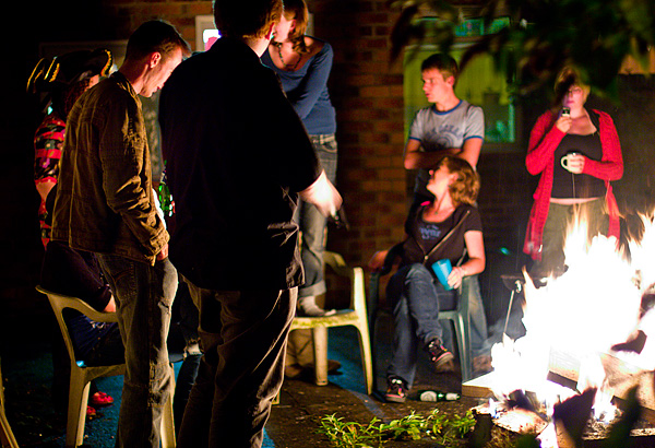
mattdm has it spot on - it's not the colour temperature that matters, it's the width of the spectrum. Here are some examples that illustrate the difference nicely.
Here's an image I shot a while ago at a bonfire. Straight of camera, without the white balance set it looks massively orange:

And here's an image shot just now under sodium vapour streetlights (I spent a while looking for any image I'd shot under streetlights, which number very few until I realised I just had to step out my front door!)

Looks similar. But if you play with the white balance in the first image, you can pull it back to somewhere near neutral. This is because the fire being an incandescent (hot) lightsource, emits a broad spectrum. It just happens to be centred on yellow rather than white like sunlight (which is another incandescent source, but much hotter!). We can simply shift the colours to obtain something more similar to daylight:
Now you can now make out the difference between foliage, skintones and denim. The streetlight image, on the other hand is lit with a fluorescent lightsource. These lights emit very narrow frequency spikes, the light is not just centred on orange, it's orange alone and no other colour! If you try to shift it so the spectrum is centred on white like we did with the bonfire image, we end up with this:

Which is effectively monochrome, even after massive saturation boost - the colours just aren't there. The apparent colours at the top and bottom are actually a lens defect that's been brought out due to the lack of colour information and exaggerated by the saturation boost (+50 in Adobe Camera Raw).
For completeness here's a Gretag MacBeth colour rendition chart shot under the same streetlight. White balance was set in ACR based on the "grey" tile:

As you can see the image might as well be monochrome. No amount of gelling of the light, or white balance adjustment can save the image. The colour information simply is not present! If you only have line spectra, all that you'll get back is how much of that particular frequency your subject reflects. Getting technical, colour is a vector-valued variable, that is it consists of several coordinates in the colour space. You can't record a point in colour space with a single value (just like you can't describe your point on a map with one value) which is what you have when you illuminate your scene with only one wavelength of light.
This is why fluorescent lights are bad, many of them emit very narrow spectra (though broader than your average streetlight). In particular many are missing a chunk of the red part of the spectrum which results in unnatural greenish skintones.
Not all fluorescent lights are bad, here's the chart illuminated by the fluorescent lights in my house which were specifically chosen for their wide spectrum (as described by the CRI (colour rendering intent) number of 93 (sunlight is 100)):

No colour problems here!

No comments:
Post a Comment